Have you ever looked at a Canva design and wondered why it looks so polished and professional, while yours feels like something is missing?
The secret isn’t always the colors, images, or layout. More often than not, it’s the typography. The fonts you choose—and more importantly, how you combine them—can completely transform the look and feel of your design.
Whether you’re creating Instagram posts, business flyers, YouTube thumbnails, presentations, logos, or marketing materials, great font pairing helps communicate your message clearly, builds visual hierarchy, and gives your designs a professional finish.
Unfortunately, many Canva users make the same mistakes. They combine too many fonts, choose styles that clash, or pick trendy typefaces that are difficult to read. The result is a design that feels cluttered, confusing, or inconsistent.
The good news is that font pairing isn’t a talent reserved for professional graphic designers. Once you understand a few simple principles, you’ll be able to confidently combine fonts that complement each other and enhance your brand.
In this comprehensive guide, you’ll learn:
- What font pairing is and why it matters
- The different font categories available in Canva
- The essential rules every designer follows when pairing fonts
- Beautiful Canva font combinations for different styles and industries
- Common font pairing mistakes to avoid
- Practical tips for creating consistent, professional-looking designs every time
Whether you’re a beginner learning Canva, a content creator, a teacher, a business owner, or a designer looking for fresh inspiration, this guide will help you choose fonts with confidence and create designs that stand out for all the right reasons.
Let’s dive into the art of Canva font pairing.
What is Font Pairing?
Font pairing is the art of combining two or more typefaces in a way that creates a visually appealing, balanced, and easy-to-read design. Instead of relying on a single font for every element, designers use different fonts to create contrast, establish hierarchy, and guide the viewer’s attention.
Think about a magazine cover or a well-designed website. The headline usually has a bold, eye-catching font, while the supporting text uses a simpler font that’s comfortable to read. Although the fonts are different, they work together to create a cohesive design. That’s the essence of effective font pairing.
In Canva, font pairing is one of the easiest ways to elevate your designs from ordinary to professional. A thoughtfully chosen font combination can make a simple social media graphic look modern, a presentation appear more polished, or a flyer instantly capture attention.
Why Designers Pair Fonts
Every piece of text in a design serves a purpose. Headlines are meant to grab attention, subheadings organize information, and body text communicates the details. Using different fonts helps each element play its role effectively.
When done correctly, font pairing helps you:
- Create a clear visual hierarchy so readers know where to look first.
- Improve readability by separating headlines from body text.
- Add personality and emotion to your designs.
- Reinforce your brand identity through consistent typography.
- Make your designs look more intentional and professionally crafted.
Font Pairing in Everyday Canva Designs
You may not realize it, but font pairing is everywhere. Here are a few common examples:
- Instagram Posts: A bold headline paired with a clean sans serif font for the caption.
- YouTube Thumbnails: A thick display font for the main title combined with a simple supporting font for extra context.
- Business Flyers: An elegant serif heading paired with a readable sans serif body font.
- Presentations: Distinct fonts for slide titles and content improve readability and audience engagement.
- Logos: Many brands combine a decorative font with a minimalist font to create a memorable visual identity.
- Certificates and Invitations: Script fonts paired with classic serif fonts create a sophisticated and elegant appearance.
Font Pairing Is About Balance
One of the biggest misconceptions is that the best font combinations use dramatic or unusual fonts. In reality, successful font pairing is all about balance.
A bold font often works beautifully with a simple one. An elegant serif pairs well with a modern sans serif. A handwritten script can add personality when combined with a clean, understated typeface.
The goal isn’t to make the fonts compete for attention—it’s to make them complement one another.
As you continue reading this guide, you’ll discover the principles professional designers use to create harmonious font combinations and learn how to apply those same techniques to your own Canva projects.
Why Font Pairing Matters
Choosing the right fonts is about much more than making a design look attractive. Typography influences how people perceive your message, interact with your content, and remember your brand. In fact, even with beautiful images and colors, poor font choices can make a design feel unprofessional or difficult to read.
Whether you’re creating content for social media, marketing a business, teaching a class, or designing a presentation, effective font pairing helps your message make a stronger impact.
1. Creates a Strong First Impression
People form opinions about a design within seconds. Before they read your message, they notice how it looks.
Well-paired fonts create an immediate sense of professionalism and credibility. On the other hand, mismatched or inconsistent fonts can make even great content appear rushed or amateurish.
Think of typography as the way your design “speaks” before anyone reads a single word.
2. Improves Readability
One of the primary goals of typography is to make information easy to read.
A bold headline captures attention, while a clean, simple font for body text allows readers to absorb information comfortably. When every piece of text uses the same font, readers may struggle to distinguish between headings, subheadings, and supporting content.
Good font pairing makes your content easier to scan, understand, and remember.
3. Creates Visual Hierarchy
Not all information is equally important. Some text should grab attention immediately, while other details provide context or explanation.
Font pairing helps establish a clear visual hierarchy by separating different levels of information.
For example:
- Headline: Large, bold, and attention-grabbing.
- Subheading: Smaller but still prominent.
- Body text: Simple, readable, and easy on the eyes.
- Call-to-action: Designed to stand out without competing with the headline.
When readers instantly know where to look first, your design becomes far more effective.
4. Communicates Your Brand Personality
Fonts have personalities, just like colors and images.
A sleek sans serif font can make a brand feel modern and innovative. A classic serif font communicates elegance and trust. A handwritten script often feels personal, creative, or luxurious.
Choosing font combinations that align with your brand helps create a consistent visual identity across all your designs.
For example:
- A technology company may pair Poppins with DM Sans to create a clean, modern look.
- A wedding planner might combine Playfair Display with Allura for an elegant and romantic feel.
- A children’s brand could use playful display fonts alongside rounded sans serif fonts to create a fun and friendly personality.
5. Makes Your Designs More Memorable
Consistent typography helps people recognize your content over time.
Imagine seeing the same font combinations on someone’s Instagram posts, presentations, website, and marketing materials. Even before reading the text, you begin to associate that visual style with their brand.
This consistency builds familiarity and strengthens brand recognition.
6. Encourages Engagement
Good typography doesn’t just look better—it also keeps people engaged.
When text is easy to read and visually organized, people are more likely to:
- Read your social media captions.
- Browse your website longer.
- Watch your presentation attentively.
- Understand your marketing message.
- Take action after reading your content.
Poor typography, on the other hand, can cause readers to lose interest before they reach your main message.
7. Helps You Stand Out
Thousands of Canva designs are created every day, many using the same templates. One of the simplest ways to make your designs feel unique is through thoughtful typography.
By pairing fonts intentionally instead of relying on Canva’s default suggestions, you can create designs that feel polished, distinctive, and aligned with your personal or business brand.
The Bottom Line
Font pairing is one of the most powerful design skills you can learn. It improves readability, creates structure, communicates personality, and gives your designs a professional finish—all without requiring advanced graphic design experience.
The best part? You don’t need to memorize hundreds of font combinations. Once you understand the characteristics of different font styles and the principles behind effective pairing, choosing the right fonts becomes much easier.
In the next section, we’ll explore the major font categories available in Canva and learn when and where each one works best.
Understanding Font Categories
Before you can create beautiful font combinations, it’s important to understand the different types of fonts available in Canva.
Think of font categories as personalities. Each category has its own unique characteristics and communicates a different mood or emotion. Once you know what each type represents, pairing fonts becomes much easier because you’ll understand which styles naturally complement one another.
Let’s explore the five major font categories you’ll encounter in Canva.
1. Serif Fonts
Serif fonts are characterized by the small decorative strokes, known as serifs, at the ends of each letter. These subtle details give serif fonts a timeless, elegant, and sophisticated appearance.
Common Characteristics
- Elegant and refined
- Traditional and trustworthy
- Professional and authoritative
- Excellent for long-form reading
Popular Serif Fonts in Canva
- Playfair Display
- Libre Baskerville
- Cormorant Garamond
- Bodoni FLF
- Lora
- Merriweather
Best Used For
- Luxury brands
- Wedding invitations
- Editorial and magazine designs
- Book covers
- Professional presentations
- Certificates
- Premium product packaging
Pairs Well With
Serif fonts pair beautifully with clean sans serif fonts like Poppins, Montserrat, DM Sans, and Open Sans, creating a balanced mix of classic elegance and modern simplicity.
2. Sans Serif Fonts
The term sans serif literally means “without serifs.” These fonts have clean, simple letterforms without decorative strokes, making them one of the most versatile choices for modern design.
Common Characteristics
- Modern and minimalist
- Clean and professional
- Easy to read on screens
- Highly versatile
Popular Sans Serif Fonts in Canva
- Poppins
- Montserrat
- DM Sans
- Open Sans
- League Spartan
- Raleway
- Lato
- Nunito
Best Used For
- Websites
- Social media graphics
- Business presentations
- Marketing materials
- Technology brands
- Educational content
- Corporate branding
Pairs Well With
Sans serif fonts work well with almost every other font category. They’re especially effective when paired with elegant serif fonts or expressive script fonts because they provide balance and readability.
3. Script Fonts
Script fonts are designed to resemble elegant handwriting or calligraphy. They add personality, warmth, and sophistication to a design but should be used sparingly.
Common Characteristics
- Elegant and graceful
- Personal and expressive
- Romantic and luxurious
- Decorative rather than practical
Popular Script Fonts in Canva
- Allura
- Brittany
- Amsterdam
- Great Vibes
- Dancing Script
- Sacramento
Best Used For
- Invitations
- Beauty brands
- Wedding designs
- Quotes
- Logos
- Signature elements
- Luxury packaging
Pairs Well With
Script fonts are most effective when paired with simple serif or sans serif fonts that keep the overall design readable. Avoid combining two script fonts, as they can compete for attention and reduce legibility.
Pro Tip: Use script fonts mainly for headlines, names, or short phrases—not for paragraphs or body text.
4. Display Fonts
Display fonts are designed to grab attention. They are bold, distinctive, and full of personality, making them ideal for large headlines and promotional graphics.
Common Characteristics
- Bold and eye-catching
- Creative and expressive
- High visual impact
- Designed for large text
Popular Display Fonts in Canva
- Anton
- Bebas Neue
- Lovelo
- League Spartan (Bold)
- Archivo Black
- Bungee
Best Used For
- Posters
- Event flyers
- YouTube thumbnails
- Sale promotions
- Headlines
- Advertisements
- Sports graphics
Pairs Well With
Display fonts should be balanced with simple body fonts such as DM Sans, Lato, Open Sans, or Poppins. Let the display font attract attention while the supporting font delivers the details.
5. Handwritten Fonts
Handwritten fonts imitate natural handwriting and are often more casual than script fonts. They help create designs that feel friendly, authentic, and approachable.
Common Characteristics
- Casual and friendly
- Creative and playful
- Authentic and personal
- Relaxed and informal
Popular Handwritten Fonts in Canva
- Hello Honey
- Gistesy
- Shadows Into Light
- Patrick Hand
- Gloria Hallelujah
Best Used For
- Lifestyle brands
- Educational resources
- Journals and planners
- Social media graphics
- DIY projects
- Personal branding
- Children’s content
Pairs Well With
Handwritten fonts pair best with clean sans serif fonts that provide structure and readability. This creates a balanced design that feels warm without becoming cluttered.
Quick Comparison of Font Categories
| Font Category | Personality | Best For |
|---|---|---|
| Serif | Elegant, classic, trustworthy | Luxury brands, editorials, invitations |
| Sans Serif | Modern, clean, professional | Websites, presentations, social media |
| Script | Elegant, romantic, expressive | Weddings, beauty brands, logos |
| Display | Bold, attention-grabbing | Posters, thumbnails, promotions |
| Handwritten | Friendly, casual, creative | Lifestyle brands, education, personal projects |
A Simple Rule to Remember
A great font pairing often combines contrast with harmony.
For example:
- Serif + Sans Serif → Classic meets modern
- Script + Sans Serif → Elegant meets clean
- Display + Sans Serif → Bold meets readable
- Handwritten + Sans Serif → Personal meets professional
The key is to let each font play a different role. One font should grab attention, while the other supports the message without competing for it.
Now that you understand the different font categories, it’s time to learn the principles that professional designers use to combine them effectively. In the next section, we’ll cover the 7 Rules of Great Canva Font Pairing—simple guidelines that will help you choose winning font combinations every time.
The 7 Rules of Great Canva Font Pairing
Now that you’re familiar with the major font categories, it’s’s time to learn the principles that make font combinations work.
Professional designers don’t randomly pick two fonts and hope for the best. They follow a few timeless rules that ensure their typography is balanced, readable, and visually appealing.
The good news? These rules are easy to understand and even easier to apply in Canva.
Rule 1: Pair Contrast, Not Conflict
One of the biggest mistakes beginners make is choosing fonts that are too similar or too different.
Two fonts that look almost identical can make your design feel dull and repetitive. On the other hand, combining two highly decorative fonts often creates visual chaos.
The goal is contrast with harmony.
Good Examples
- Playfair Display + Poppins
- Cormorant Garamond + DM Sans
- Anton + Open Sans
In each pairing, one font has a distinct personality while the other provides balance.
Avoid
- Pairing two script fonts
- Pairing two decorative display fonts
- Pairing fonts that have nearly identical shapes but slightly different styles
Tip: If one font is expressive, let the other be simple.
Rule 2: Limit Yourself to Two or Three Fonts
Using too many fonts is one of the quickest ways to make a design feel cluttered.
As a general rule:
- One font can work for minimal designs.
- Two fonts are ideal for most Canva projects.
- Three fonts should be the maximum, and only when used intentionally.
A simple structure might look like this:
- Headline: Playfair Display
- Subheading: Poppins SemiBold
- Body Text: Poppins Regular
Notice that only two font families are used. Different weights create variety without introducing unnecessary complexity.
Remember: Simplicity almost always wins.
Rule 3: Give Each Font a Clear Role
Every font in your design should have a purpose.
Ask yourself:
- Which font grabs attention?
- Which font supports the message?
- Which font improves readability?
For example:
Headline: Anton
Body: DM Sans
Anton captures attention immediately, while DM Sans ensures the supporting information is easy to read.
Avoid making every font compete for attention. Your design should have one clear visual focal point.
Rule 4: Prioritize Readability
A beautiful font is useless if people struggle to read it.
Decorative fonts are perfect for headlines, logos, or short quotes—but they shouldn’t be used for long paragraphs.
For body text, choose fonts designed for readability, such as:
- DM Sans
- Open Sans
- Lato
- Nunito
- Poppins
- Montserrat
These fonts remain clear on mobile devices, presentations, websites, and printed materials.
Ask yourself: If someone had to read this quickly, would they find it easy?
If the answer is no, choose a simpler font.
Rule 5: Create Hierarchy with Size and Weight
Great typography isn’t just about choosing different fonts—it’s also about using size and weight effectively.
Instead of introducing another font, try changing:
- Font size
- Boldness
- Letter spacing
- Line spacing
- Capitalization
For example:
Headline: Poppins ExtraBold, 48 pt
Subheading: Poppins Medium, 24 pt
Body: Poppins Regular, 16 pt
Even though the same font family is used throughout, the design feels organized because each text element has a clear level of importance.
Sometimes, varying the weight of a single font family is all you need.
Rule 6: Match the Fonts to Your Brand Personality
Fonts communicate emotion before people even read your message.
Ask yourself:
How do I want people to perceive my brand?
Choose fonts that reinforce that impression.
| Brand Personality | Recommended Font Style |
|---|---|
| Modern | Poppins, DM Sans, Montserrat |
| Elegant | Playfair Display, Cormorant Garamond |
| Luxury | Bodoni FLF, The Seasons |
| Friendly | Nunito, Quicksand |
| Creative | Anton, Lovelo, Bebas Neue |
| Professional | Open Sans, Lato, Raleway |
For example:
A law firm and a children’s daycare shouldn’t use the same typography. Their fonts should reflect their unique personalities and audiences.
Consistency in your font choices helps people recognize and remember your brand.
Rule 7: Always Preview Your Design Before Publishing
A font pairing that looks amazing on your desktop may not work as well on a phone screen or when printed.
Before sharing your design:
- Zoom out and check the overall balance.
- View it on a mobile device.
- Make sure the headline stands out.
- Ensure body text is easy to read.
- Check spacing between letters and lines.
- Confirm that the fonts still complement each other at different sizes.
Taking a few extra seconds to review your typography can make a significant difference in the final result.
Quick Font Pairing Checklist
Before you publish any Canva design, ask yourself these seven questions:
- ✔ Do my fonts complement rather than compete?
- ✔ Am I using no more than three font families?
- ✔ Does each font have a clear purpose?
- ✔ Is the body text easy to read?
- ✔ Is there a clear visual hierarchy?
- ✔ Do the fonts match my brand personality?
- ✔ Have I tested the design on different screen sizes?
If you answered “yes” to each question, you’re already thinking like a designer.
What’s Next?
Now that you understand the principles behind great typography, it’s time for the fun part.
In the next section, we’ll explore the best Canva font pairings, organized by style, industry, and design purpose. You’ll discover ready-to-use combinations that you can apply to your own projects immediately.
The Best Canva Font Pairings
Now that you understand the principles of font pairing, it’s time to put them into practice.
The combinations below are organized by design style, making it easier to find the perfect pairing for your brand or project. For each combination, you’ll learn why it works and where it’s best used.
Remember, these aren’t the only great font pairings available in Canva—they’re simply some of the most versatile and effective combinations trusted by designers.
Modern & Professional Font Pairings
Modern designs are clean, minimal, and easy to read. They work exceptionally well for businesses, technology brands, educators, consultants, startups, and content creators.
1. Poppins + DM Sans
Why it works
Poppins has bold geometric letterforms that create strong, attention-grabbing headlines. DM Sans complements it with clean, highly readable body text.
Perfect for
- Business presentations
- Websites
- Instagram carousels
- Educational materials
- Corporate branding
Best Practice
Use Poppins Bold for headings and DM Sans Regular for paragraphs.
2. League Spartan + Open Sans
Why it works
League Spartan is bold and confident, while Open Sans softens the design with excellent readability.
Perfect for
- Marketing graphics
- Startup brands
- Landing pages
- Course slides
Design Style
Bold, modern, and trustworthy.
3. Montserrat + Lato
Why it works
Both fonts belong to the sans serif family, but they have enough contrast to create a polished and professional appearance.
Perfect for
- Reports
- Business proposals
- Corporate documents
- LinkedIn graphics
Design Style
Clean and corporate.
4. Raleway + Nunito
Why it works
Raleway adds elegance with its refined letterforms, while Nunito introduces warmth through its rounded shapes.
Perfect for
- Personal brands
- Lifestyle businesses
- Coaching brands
- Blogs
Design Style
Modern with a friendly touch.
5. League Spartan + Inter
Why it works
League Spartan delivers impact, while Inter is optimized for readability across digital platforms.
Perfect for
- SaaS websites
- Tech companies
- Product launches
- User interfaces
Design Style
Minimal and contemporary.
Elegant & Luxury Font Pairings
Luxury typography emphasizes sophistication, refinement, and timeless beauty. These combinations are ideal for premium brands, weddings, fashion, beauty, and high-end marketing.
6. Playfair Display + Poppins
Why it works
Playfair Display brings classic elegance, while Poppins adds a modern touch that keeps the design fresh.
Perfect for
- Fashion brands
- Beauty businesses
- Boutique stores
- Editorial layouts
Design Style
Elegant yet contemporary.
7. Cormorant Garamond + DM Sans
Why it works
Cormorant Garamond creates a luxurious editorial feel, balanced beautifully by the simplicity of DM Sans.
Perfect for
- Luxury packaging
- Personal branding
- Magazines
- Premium services
Design Style
Refined and sophisticated.
8. Bodoni FLF + Open Sans
Why it works
Bodoni’s dramatic contrast instantly communicates luxury, while Open Sans keeps supporting information readable.
Perfect for
- Jewelry brands
- Cosmetics
- Luxury brochures
- Event invitations
Design Style
High-end and elegant.
9. Libre Baskerville + Montserrat
Why it works
The timeless character of Libre Baskerville pairs naturally with the clean simplicity of Montserrat.
Perfect for
- Law firms
- Financial consultants
- Universities
- Professional services
Design Style
Classic professionalism.
10. Lora + Poppins
Why it works
Lora feels warm and approachable, while Poppins keeps the overall design modern.
Perfect for
- Bloggers
- Authors
- Coaches
- Online courses
Design Style
Friendly elegance.
Minimalist Font Pairings
Sometimes less is more. Minimalist typography focuses on clarity, generous spacing, and simplicity.
11. Poppins + Poppins
Why it works
Using one font family with different weights creates consistency while maintaining a clean hierarchy.
Perfect for
- Mobile apps
- Websites
- Pitch decks
- Portfolios
Design Style
Simple, modern, and timeless.
12. Inter + Inter
Why it works
Inter was designed specifically for digital readability. Different weights provide enough contrast without introducing another font family.
Perfect for
- Dashboards
- UI design
- Reports
- Product documentation
13. Montserrat + Montserrat
Why it works
A single-family approach keeps the design cohesive while allowing bold headings and light body text to create hierarchy.
Perfect for
- Brand guidelines
- Presentations
- Corporate templates
Creative & Bold Font Pairings
Need to grab attention? These combinations are designed to make headlines impossible to ignore.
14. Anton + DM Sans
Why it works
Anton commands attention, while DM Sans keeps the supporting message clean and readable.
Perfect for
- YouTube thumbnails
- Posters
- Event promotions
- Sales graphics
Design Style
Bold and energetic.
15. Bebas Neue + Poppins
Why it works
Bebas Neue creates strong visual impact, and Poppins provides modern balance.
Perfect for
- Sports graphics
- Product launches
- Advertising campaigns
- Conference banners
16. Archivo Black + Open Sans
Why it works
Archivo Black creates bold headlines without overwhelming the design, while Open Sans maintains excellent readability.
Perfect for
- Promotional flyers
- Events
- Retail campaigns
17. Lovelo + Lato
Why it works
Lovelo’s geometric style pairs well with Lato’s soft, approachable character.
Perfect for
- Creative agencies
- Photography brands
- Portfolio websites
Feminine & Lifestyle Font Pairings
These combinations feel elegant, warm, and inviting, making them ideal for lifestyle and creative brands.
18. Allura + Poppins
Why it works
Allura adds graceful elegance, while Poppins keeps the overall design modern and balanced.
Perfect for
- Wedding invitations
- Beauty brands
- Fashion boutiques
- Personal branding
19. Great Vibes + Montserrat
Why it works
Great Vibes creates a luxurious handwritten feel, while Montserrat adds clarity and structure.
Perfect for
- Event planning
- Luxury packaging
- Social media graphics
20. Dancing Script + Nunito
Why it works
This combination feels cheerful, friendly, and approachable without sacrificing readability.
Perfect for
- Lifestyle blogs
- Cafés
- Handmade products
- Creative businesses
Quick Reference Table
| Design Style | Recommended Pairing |
|---|---|
| Modern | Poppins + DM Sans |
| Professional | Montserrat + Lato |
| Tech | League Spartan + Inter |
| Luxury | Playfair Display + Poppins |
| Editorial | Cormorant Garamond + DM Sans |
| Corporate | Libre Baskerville + Montserrat |
| Minimalist | Poppins + Poppins |
| Creative | Anton + DM Sans |
| Promotional | Bebas Neue + Poppins |
| Lifestyle | Dancing Script + Nunito |
| Wedding | Allura + Poppins |
| Beauty | Great Vibes + Montserrat |
Pro Tip
Don’t feel limited to these exact combinations. Once you understand why each pairing works, you’ll be able to create your own combinations with confidence.
A simple formula to remember is:
- Bold font + Simple font
- Elegant font + Modern font
- Decorative font + Readable font
- Expressive font + Neutral font
Following these principles will help you create designs that are both visually striking and easy to read.
In the next section, we’ll go a step further by recommending the best Canva font pairings for specific industries—from educators and coaches to churches, restaurants, fashion brands, and technology startups.
Canva Font Pairings for Different Industries
Choosing the right font combination isn’t just about aesthetics—it’s about communicating the right message to the right audience.
A font pairing that works beautifully for a luxury fashion brand may feel completely out of place for a law firm or a primary school. That’s why it’s important to consider your industry, your audience, and the personality you want your brand to convey.
Below are some recommended Canva font pairings for popular industries and professions, along with why they work.
1. Educators and Schools
Recommended Pairings
- Poppins + DM Sans
- Montserrat + Open Sans
- League Spartan + Nunito
Why These Work
Educational materials should be clear, approachable, and easy to read. Sans serif fonts provide excellent readability on both printed and digital learning resources, while bold headings help students quickly identify key information.
Perfect For
- Classroom presentations
- Worksheets
- Lesson plans
- School newsletters
- Educational infographics
- Online course slides
2. Coaches and Consultants
Recommended Pairings
- Playfair Display + Poppins
- Lora + DM Sans
- Raleway + Nunito
Why These Work
Coaches and consultants need typography that communicates professionalism while remaining approachable. These combinations strike the perfect balance between authority and warmth.
Perfect For
- Instagram posts
- Lead magnets
- Webinar slides
- Business proposals
- Personal branding
- Landing pages
3. Churches and Faith-Based Organizations
Recommended Pairings
- Cormorant Garamond + Montserrat
- Libre Baskerville + Open Sans
- Playfair Display + Lato
Why These Work
Church communications often aim to inspire, encourage, and inform. Elegant serif fonts create a sense of reverence and tradition, while clean sans serif fonts ensure event details remain easy to read.
Perfect For
- Church flyers
- Sermon graphics
- Conference banners
- Social media announcements
- Event programs
- Devotional booklets
4. Beauty Brands and Salons
Recommended Pairings
- Allura + Poppins
- Great Vibes + Montserrat
- Playfair Display + DM Sans
Why These Work
Beauty brands often want to communicate elegance, sophistication, and luxury. A graceful script or serif headline paired with a modern sans serif creates a premium, polished look.
Perfect For
- Product packaging
- Appointment cards
- Promotional graphics
- Instagram posts
- Beauty magazines
- Price lists
5. Fashion and Lifestyle Brands
Recommended Pairings
- Bodoni FLF + Poppins
- Playfair Display + Open Sans
- Cormorant Garamond + DM Sans
Why These Work
Fashion typography should feel stylish, refined, and editorial. High-contrast serif fonts naturally create a luxurious appearance while simple supporting fonts maintain readability.
Perfect For
- Lookbooks
- Fashion campaigns
- Catalogs
- Boutique websites
- Magazine layouts
- Product launches
6. Restaurants, Cafés, and Food Businesses
Recommended Pairings
- Bebas Neue + Lato
- Anton + Open Sans
- Playfair Display + Montserrat
Why These Work
Food businesses benefit from typography that captures attention quickly. Bold headlines help showcase promotions and menu items, while readable body fonts make descriptions easy to scan.
Perfect For
- Menus
- Posters
- Social media promotions
- Food packaging
- Table displays
- Event flyers
7. Real Estate Agencies
Recommended Pairings
- Libre Baskerville + Poppins
- Playfair Display + DM Sans
- Montserrat + Lora
Why These Work
Real estate marketing should communicate trust, professionalism, and premium service. Elegant typography helps properties appear more desirable while maintaining a polished corporate image.
Perfect For
- Property brochures
- Open house flyers
- Social media ads
- Presentation decks
- Business cards
8. Technology Companies and Startups
Recommended Pairings
- League Spartan + Inter
- Poppins + DM Sans
- Montserrat + Open Sans
Why These Work
Technology brands often prioritize simplicity, clarity, and innovation. Clean sans serif combinations create a modern aesthetic that aligns well with digital products and services.
Perfect For
- SaaS websites
- Product presentations
- User guides
- Investor pitch decks
- App interfaces
- Marketing materials
9. Small Businesses and Entrepreneurs
Recommended Pairings
- Poppins + DM Sans
- Montserrat + Lato
- Raleway + Nunito
Why These Work
Entrepreneurs need versatile typography that works across multiple platforms—from Instagram and WhatsApp to websites, presentations, and printed materials. These combinations are flexible enough for almost any business.
Perfect For
- Social media content
- Flyers
- Business proposals
- Quotations
- Product catalogs
- Email newsletters
10. Content Creators and YouTubers
Recommended Pairings
- Anton + Poppins
- Bebas Neue + DM Sans
- League Spartan + Inter
Why These Work
Content creators need typography that grabs attention instantly. Bold display fonts increase visibility on thumbnails, while clean supporting fonts make subtitles and additional text easy to read.
Perfect For
- YouTube thumbnails
- Reel covers
- Podcast artwork
- Channel banners
- Course promotions
- Social media graphics
11. Nonprofits and Community Organizations
Recommended Pairings
- Lora + Open Sans
- Montserrat + Nunito
- Libre Baskerville + DM Sans
Why These Work
Nonprofit organizations often want to appear trustworthy, compassionate, and accessible. These pairings balance professionalism with warmth, making them ideal for communicating missions, campaigns, and community impact.
Perfect For
- Fundraising campaigns
- Volunteer recruitment
- Annual reports
- Event posters
- Awareness graphics
Quick Industry Reference
| Industry | Recommended Font Pairing |
|---|---|
| Education | Poppins + DM Sans |
| Coaching | Playfair Display + Poppins |
| Church | Cormorant Garamond + Montserrat |
| Beauty | Allura + Poppins |
| Fashion | Bodoni FLF + Poppins |
| Restaurant | Bebas Neue + Lato |
| Real Estate | Libre Baskerville + Poppins |
| Technology | League Spartan + Inter |
| Small Business | Montserrat + Lato |
| Content Creation | Anton + Poppins |
| Nonprofit | Lora + Open Sans |
A Final Tip for Choosing Fonts
Your industry provides a helpful starting point, but your brand personality should always guide your final decision.
Ask yourself:
- Do I want my brand to feel modern or classic?
- Should it appear bold or understated?
- Is my audience looking for professionalism, creativity, luxury, or friendliness?
The best font pairing is one that not only looks beautiful but also reinforces your message and resonates with the people you’re trying to reach.
In the next section, we’ll move beyond industries and explore the best Canva font pairings for specific design projects, including Instagram posts, YouTube thumbnails, presentations, business cards, logos, resumes, and more.
Canva Font Pairings for Different Design Types
While your industry influences your font choices, the type of design you’re creating is just as important.
A YouTube thumbnail, for example, has very different typography needs than a business card or a presentation. Each design has a unique purpose, viewing distance, and audience, so choosing the right font combination can significantly improve its effectiveness.
Here are some of the best Canva font pairings for common design projects.
1. Instagram Posts
Recommended Pairings
- Poppins + DM Sans
- Playfair Display + Montserrat
- League Spartan + Inter
Why These Work
Instagram users scroll quickly. Your headline needs to stop the scroll, while the supporting text should remain clear even on a small screen.
Best For
- Educational carousels
- Quotes
- Promotions
- Product launches
- Tips and tutorials
Pro Tip: Keep your headline short and use bold font weights to improve visibility.
2. Instagram Reels Covers
Recommended Pairings
- Anton + Poppins
- League Spartan + DM Sans
- Bebas Neue + Inter
Why These Work
Your cover image should instantly communicate what the video is about. Bold display fonts ensure your title remains readable even in Instagram’s small grid view.
Best For
- Tutorials
- Before-and-after transformations
- Product demonstrations
- Educational videos
Pro Tip: Limit your cover title to five or six words for maximum impact.
3. YouTube Thumbnails
Recommended Pairings
- Anton + Poppins
- Bebas Neue + DM Sans
- Archivo Black + Open Sans
Why These Work
YouTube thumbnails compete for attention. Strong display fonts create eye-catching headlines, while clean supporting fonts provide context without cluttering the design.
Best For
- Tutorials
- Reviews
- Product launches
- Educational content
- Vlogs
Pro Tip: Use no more than three to six words in your thumbnail headline.
4. Presentations
Recommended Pairings
- Poppins + DM Sans
- Montserrat + Lato
- Playfair Display + Open Sans
Why These Work
Presentation slides should be easy to read from a distance. Clean typography keeps your audience focused on your message instead of struggling to read your content.
Best For
- Business meetings
- Classroom lessons
- Conference presentations
- Training workshops
Pro Tip: Avoid decorative fonts for body text. Reserve them for titles if needed.
5. Business Flyers
Recommended Pairings
- League Spartan + Open Sans
- Anton + DM Sans
- Playfair Display + Montserrat
Why These Work
Flyers need to grab attention immediately while clearly communicating important information such as dates, prices, or contact details.
Best For
- Events
- Sales promotions
- Church programs
- Community announcements
- Workshops
Pro Tip: Create a strong hierarchy so readers can quickly identify the headline, key details, and call to action.
6. Posters and Event Banners
Recommended Pairings
- Anton + Open Sans
- Bebas Neue + Poppins
- League Spartan + Inter
Why These Work
Posters are often viewed from a distance, so large, bold headlines are essential. Supporting text should remain simple and readable.
Best For
- Conferences
- Concerts
- Community events
- Sporting events
- Promotional campaigns
Pro Tip: Prioritize large text sizes and generous spacing to improve readability.
7. Logos
Recommended Pairings
- Playfair Display + Poppins
- Cormorant Garamond + Montserrat
- League Spartan + DM Sans
Why These Work
A logo should reflect your brand personality while remaining timeless and versatile. Pairing an expressive headline font with a simple supporting font creates a balanced identity.
Best For
- Personal brands
- Small businesses
- Creative agencies
- Startups
Pro Tip: Test your logo in both color and black-and-white to ensure the typography remains clear.
8. Business Cards
Recommended Pairings
- Montserrat + Open Sans
- Poppins + DM Sans
- Libre Baskerville + Lato
Why These Work
Business cards contain limited space, so clarity is essential. Clean typography helps recipients quickly find your name, title, and contact information.
Best For
- Professionals
- Consultants
- Entrepreneurs
- Freelancers
Pro Tip: Avoid using more than two font families on a business card.
9. Certificates
Recommended Pairings
- Playfair Display + Lato
- Cormorant Garamond + Open Sans
- Libre Baskerville + Montserrat
Why These Work
Certificates should feel prestigious and formal. Elegant serif fonts communicate achievement and professionalism, while modern body fonts ensure names and details remain readable.
Best For
- Schools
- Training organizations
- Workshops
- Awards
- Recognition programs
Pro Tip: Reserve decorative fonts for titles only. Keep participant names highly legible.
10. Resumes and CVs
Recommended Pairings
- Lato + Montserrat
- Open Sans + Poppins
- Merriweather + DM Sans
Why These Work
Recruiters spend only a few seconds scanning a resume. Clean, professional typography improves readability and helps important information stand out.
Best For
- Job applications
- Academic CVs
- Professional portfolios
Pro Tip: Choose readability over creativity. Your experience should be the focus—not unusual typography.
11. Websites and Landing Pages
Recommended Pairings
- Poppins + Inter
- Montserrat + Open Sans
- Playfair Display + DM Sans
Why These Work
Web typography must look great across desktops, tablets, and smartphones. These pairings balance personality with excellent on-screen readability.
Best For
- Business websites
- Portfolio sites
- Online stores
- Landing pages
- Blogs
Pro Tip: Maintain consistent typography across every page to strengthen your brand identity.
12. E-books and Lead Magnets
Recommended Pairings
- Libre Baskerville + Lato
- Playfair Display + Open Sans
- Poppins + DM Sans
Why These Work
Long-form documents require fonts that reduce eye strain while maintaining a polished appearance. These combinations make reading comfortable and enjoyable.
Best For
- Guides
- Workbooks
- Reports
- Checklists
- Digital downloads
Pro Tip: Increase line spacing and avoid overly condensed fonts for long passages of text.
Quick Reference Guide
| Design Type | Recommended Font Pairing |
|---|---|
| Instagram Posts | Poppins + DM Sans |
| Reels Covers | Anton + Poppins |
| YouTube Thumbnails | Bebas Neue + DM Sans |
| Presentations | Montserrat + Lato |
| Flyers | League Spartan + Open Sans |
| Posters | Anton + Open Sans |
| Logos | Playfair Display + Poppins |
| Business Cards | Poppins + DM Sans |
| Certificates | Cormorant Garamond + Open Sans |
| Resumes | Lato + Montserrat |
| Websites | Poppins + Inter |
| E-books | Libre Baskerville + Lato |
One Simple Rule to Remember
No matter what you’re designing, every font pairing should answer these three questions:
- Does it grab attention where needed?
- Is it easy to read?
- Does it reflect my brand or message?
If the answer to all three is yes, you’ve likely chosen a strong font combination.
Now that you’ve seen recommended pairings for different projects, let’s look at the common mistakes that can ruin even the most beautiful designs—and, more importantly, how to avoid them.
Canva Font Pairing Mistakes to Avoid
Even with access to hundreds of beautiful fonts in Canva, it’s surprisingly easy to create designs that look cluttered, unprofessional, or difficult to read.
The good news is that most typography mistakes are easy to fix once you know what to look for.
Below are some of the most common font pairing mistakes Canva users make—and how you can avoid them.
1. Using Too Many Fonts
One of the biggest mistakes beginners make is trying to use every beautiful font they discover.
A design with four, five, or even six different font families quickly becomes visually overwhelming. Instead of guiding the reader’s attention, it creates confusion.
❌ Avoid
- A script font for the headline
- A serif font for the subheading
- A different sans serif for the body
- Another display font for the call-to-action
✅ Do This Instead
Stick to two font families for most designs.
For example:
- Headline: Playfair Display
- Body: Poppins
Or even better, use one font family with different weights when creating minimalist designs.
2. Pairing Fonts That Look Too Similar
Many people assume similar fonts automatically pair well together. In reality, they often compete because they don’t create enough visual contrast.
For example, combining Montserrat with Poppins may look redundant in many designs because both are modern geometric sans serif fonts with similar characteristics.
❌ Avoid
- Montserrat + Poppins
- Open Sans + Lato (for prominent headings)
- Raleway + Montserrat (without enough size or weight contrast)
✅ Do This Instead
Pair fonts from different categories or with clearly different personalities.
Examples:
- Playfair Display + Poppins
- Anton + DM Sans
- Cormorant Garamond + Inter
The contrast creates a stronger visual hierarchy.
3. Combining Two Decorative Fonts
Script fonts and display fonts are designed to attract attention. Using two of them together often creates unnecessary competition.
Imagine pairing a bold display font with an elaborate script font. Instead of complementing each other, they fight for attention.
❌ Avoid
- Anton + Bebas Neue
- Allura + Great Vibes
- Lovelo + Archivo Black
✅ Do This Instead
Let one decorative font shine while pairing it with a clean, readable supporting font.
For example:
- Anton + Poppins
- Allura + DM Sans
- Bebas Neue + Open Sans
4. Ignoring Readability
A font may look beautiful, but if people can’t read it easily, it isn’t serving its purpose.
This mistake is especially common when using script fonts for long paragraphs or placing light-colored text on busy backgrounds.
❌ Avoid
- Script fonts for body text
- Tiny font sizes
- Thin fonts on complex images
- Low color contrast between text and background
✅ Do This Instead
Reserve decorative fonts for:
- Headlines
- Names
- Quotes
- Short phrases
Use highly readable fonts like:
- DM Sans
- Lato
- Open Sans
- Nunito
- Inter
for longer passages.
Remember: readability always comes before style.
5. Using the Same Font Weight Everywhere
Even if you’re using a single font family, making every heading and paragraph the same size and weight creates a flat, uninspiring design.
Readers won’t know where to look first.
❌ Avoid
Every line in:
- Regular weight
- Same size
- Same spacing
✅ Do This Instead
Create hierarchy by varying:
- Font size
- Font weight
- Letter spacing
- Line spacing
For example:
- Heading: Poppins Bold
- Subheading: Poppins SemiBold
- Body: Poppins Regular
Simple changes like these make your content much easier to scan.
6. Forgetting Your Brand Personality
A font pairing should reflect your brand—not just current design trends.
For example:
A luxury jewelry brand probably shouldn’t use playful handwritten fonts, while a children’s learning center may not benefit from rigid, formal typography.
Ask Yourself
Does this typography communicate:
- Professionalism?
- Creativity?
- Luxury?
- Friendliness?
- Innovation?
- Trust?
If not, reconsider your font choices.
Your typography should support your message, not contradict it.
7. Ignoring Mobile Users
Many Canva designs are viewed on smartphones rather than desktop computers.
Text that looks perfect on a laptop may become unreadable on a smaller screen.
Before Publishing
Always preview your design on mobile and check:
- Is the headline still readable?
- Is the body text large enough?
- Are important details easy to spot?
- Does the typography still feel balanced?
A few seconds of testing can prevent a poor user experience.
8. Relying Only on Font Choices
Typography is about more than choosing good fonts.
Spacing, alignment, and layout all influence how your text is perceived.
Even the perfect font pairing can look unprofessional if the text is poorly arranged.
Pay attention to:
- Alignment
- White space
- Line spacing
- Letter spacing
- Margins
- Consistent sizing
Good typography is the combination of all these elements working together.
9. Following Trends Without Considering Longevity
Trendy fonts can be exciting, but trends change quickly.
If you’re designing brand assets like logos, websites, or business materials, choose timeless fonts that will still look professional years from now.
Reserve trendy display fonts for temporary campaigns such as:
- Seasonal promotions
- Social media graphics
- Event posters
- Limited-time offers
For long-term branding, classic fonts are usually the safer choice.
10. Never Experimenting
Some Canva users stick to the same font pairing for every project because they’re afraid to try something new.
While consistency is important, experimentation is how you develop your design eye.
Create duplicate versions of your design using different font pairings.
Then compare them side by side and ask:
- Which one feels more balanced?
- Which one communicates the message better?
- Which one is easier to read?
- Which one best represents the brand?
Over time, you’ll begin to recognize strong font pairings instinctively.
Quick Checklist Before You Publish
Before clicking Share or Download, take one last look at your design and ask yourself:
- ✔ Am I using no more than two or three font families?
- ✔ Do my fonts complement each other?
- ✔ Is my text easy to read on desktop and mobile?
- ✔ Have I created a clear visual hierarchy?
- ✔ Does the typography match my brand personality?
- ✔ Is there enough spacing between text elements?
- ✔ Does the design feel clean rather than cluttered?
If you can confidently answer yes to these questions, your typography is likely helping—not hurting—your design.
Final Thought
Great typography isn’t about following strict rules or memorizing dozens of font combinations. It’s about making intentional choices that improve clarity, strengthen your message, and create a better experience for your audience.
The more you practice, the easier it becomes to recognize which fonts work well together—and before long, choosing the right pairing will feel like second nature.
In the next section, we’ll explore how you can save and reuse your favorite font pairings in Canva, helping you create consistent, on-brand designs faster every time.
How to Save and Reuse Font Pairings in Canva
Finding a font pairing you love is one thing. Using it consistently across every design is what builds a recognizable brand.
Imagine if Coca-Cola used a different logo font every week or if Netflix changed its typography with every social media post. Their brands would feel inconsistent and less memorable.
Whether you’re a business owner, content creator, educator, or freelancer, using the same font pairings repeatedly helps people recognize your work instantly.
The good news is that Canva makes it easy to maintain typography consistency.
Why Consistency Matters
Consistent typography helps you:
- Build a recognizable brand
- Save time when creating new designs
- Make your content look more professional
- Create a cohesive experience across different platforms
- Eliminate the guesswork of choosing fonts for every project
Instead of asking, “Which fonts should I use today?”, you’ll already have a proven combination that works.
Method 1: Use Canva Brand Kit (Canva Pro)
If you’re a Canva Pro user, the Brand Kit is the easiest way to save your preferred font pairings.
How to Set It Up
- Open Canva.
- Go to Brand from the left sidebar.
- Select your Brand Kit.
- Under Brand Fonts, choose your:
- Heading font
- Subheading font
- Body font
- Save your selections.
Once configured, Canva automatically suggests these fonts whenever you create a new design.
Why Use Brand Kit?
- Keeps every design on brand
- Saves time
- Makes collaboration easier for teams
- Ensures consistency across presentations, social media, websites, and print materials
Example
- Heading: Poppins
- Subheading: DM Sans SemiBold
- Body: DM Sans Regular
Every new design starts with your chosen typography.
Method 2: Create a Brand Template
Even if you don’t have Canva Pro, you can still maintain consistent typography.
Create a master design that includes:
- Your favorite fonts
- Brand colors
- Logo
- Spacing
- Text styles
Whenever you need a new design:
- Duplicate the template.
- Replace the content.
- Keep the typography unchanged.
This approach is perfect for:
- Instagram posts
- Facebook graphics
- Presentation slides
- YouTube thumbnails
- Flyers
- Workbooks
Method 3: Save Text Styles
If you frequently use the same heading sizes and font weights, create reusable text styles.
For example:
Heading
- Poppins ExtraBold
- 48 pt
Subheading
- Poppins SemiBold
- 28 pt
Body
- DM Sans Regular
- 16 pt
Whenever you duplicate a previous design, these styles remain intact, making future projects much faster.
Method 4: Duplicate Successful Designs
One of the easiest ways to stay consistent is to duplicate designs that already work well.
If a particular Instagram carousel or presentation receives excellent engagement:
- Duplicate it.
- Replace the text.
- Update the images.
- Keep the typography.
This creates consistency while reducing design time.
Many professional designers rely on this workflow rather than starting from scratch every time.
Method 5: Build Your Own Font Pairing Library
As you discover font combinations you love, keep a personal reference document.
You could create a simple Canva page or spreadsheet with sections like:
Modern
- Poppins + DM Sans
- League Spartan + Inter
Luxury
- Playfair Display + Poppins
- Cormorant Garamond + DM Sans
Corporate
- Montserrat + Lato
- Libre Baskerville + Open Sans
Creative
- Anton + DM Sans
- Bebas Neue + Poppins
Elegant
- Bodoni FLF + Montserrat
- Lora + DM Sans
Over time, you’ll build a collection of trusted combinations that you can reuse confidently.
Method 6: Use Typography Consistently Across Platforms
Your font pairings shouldn’t change dramatically from one platform to another.
Aim for consistency across:
- Website
- Blog
- YouTube thumbnails
- Presentation slides
- Business cards
- Flyers
- Email newsletters
When people repeatedly see the same typography, they begin to associate it with your brand—even before they read your content.
Create a Simple Typography Style Guide
A typography style guide doesn’t have to be complicated.
Create a one-page document that includes:
Heading Font
Poppins Bold
Body Font
DM Sans Regular
Heading Sizes
- H1: 48 pt
- H2: 36 pt
- H3: 28 pt
Body Sizes
- Paragraph: 16 pt
- Caption: 14 pt
- Small Notes: 12 pt
Font Colors
- Primary Text
- Secondary Text
- Accent Color
Having these standards documented ensures consistency whether you’re designing alone or working with a team.
Common Questions About Saving Font Pairings
Can I use different font pairings for different projects?
Yes—but keep your core brand typography consistent. You might use a bold display font for a special campaign while keeping your primary heading and body fonts unchanged.
Should I change my brand fonts often?
Generally, no. Frequent changes make it harder for your audience to recognize your brand. Unless you’re undergoing a full rebrand, stick with your chosen typography.
How many font pairings should I save?
Most brands only need:
- One primary pairing
- One secondary pairing for special projects
- One display font for promotional graphics
That’s usually enough to cover nearly every design you’ll create.
Final Thoughts
Choosing beautiful fonts is only half the battle. The real magic happens when you use them consistently.
By saving your favorite font pairings, creating reusable templates, and documenting your typography choices, you’ll design faster, maintain a professional look, and build a stronger visual identity over time.
Remember: consistency doesn’t limit creativity—it gives your creativity a recognizable signature.
In the next section, we’ll answer some of the most frequently asked questions about Canva font pairing, including how many fonts you should use, whether Canva’s font combinations are free, and which fonts pair best with popular favorites like Poppins and Montserrat.
Frequently Asked Questions About Canva Font Pairing
Whether you’re just getting started with Canva or looking to improve your design skills, you’ve probably asked yourself some of these questions. Here are clear answers to the most common questions about Canva font pairing.
1. What is the best font pairing in Canva?
There isn’t a single “best” font pairing because the right combination depends on your brand, audience, and the type of design you’re creating.
That said, these pairings are consistently popular because they’re versatile and work across many design styles:
- Poppins + DM Sans – Modern and professional
- Playfair Display + Poppins – Elegant and contemporary
- Montserrat + Lato – Clean and corporate
- Anton + Open Sans – Bold and attention-grabbing
- Cormorant Garamond + DM Sans – Sophisticated and editorial
If you’re unsure where to start, Poppins + DM Sans is one of the safest and most versatile combinations available in Canva.
2. How Many Fonts Should I Use in One Design?
For most Canva projects, two font families are ideal.
A good structure looks like this:
- Headline: One font family
- Body text: A second font family
If you need additional variety, use different font weights (Bold, SemiBold, Regular, Light) instead of introducing another font family.
As a general guideline:
- 1 font: Minimalist designs
- 2 fonts: Recommended for most projects
- 3 fonts: Only when used intentionally
Anything beyond three font families usually makes a design feel cluttered.
3. Which Fonts Pair Well with Poppins?
Poppins is one of Canva’s most versatile fonts because its clean, geometric style works with both classic and modern typefaces.
Some excellent pairings include:
- Poppins + Playfair Display
- Poppins + Cormorant Garamond
- Poppins + DM Sans
- Poppins + Lora
- Poppins + Bebas Neue (for bold promotional designs)
Because Poppins is highly readable, it works equally well as a heading or body font.
4. Which Fonts Pair Well with Montserrat?
Montserrat is another popular sans serif font that complements a wide variety of styles.
Great combinations include:
- Montserrat + Libre Baskerville
- Montserrat + Great Vibes
- Montserrat + Playfair Display
- Montserrat + Lato
- Montserrat + Open Sans
Montserrat is particularly effective for websites, presentations, and business branding.
5. Can I Use Only One Font in Canva?
Absolutely.
Many professional designers use a single font family throughout an entire design.
The key is to create contrast by varying:
- Font size
- Font weight
- Letter spacing
- Line spacing
For example:
- Heading: Poppins ExtraBold
- Subheading: Poppins SemiBold
- Body: Poppins Regular
This approach creates a clean, modern, and cohesive design.
6. Are Canva Fonts Free to Use?
Yes. Canva includes a large library of fonts that are available with the free plan.
However, some premium fonts are only available to Canva Pro users.
If you collaborate with others, remember that everyone editing the design must have access to the fonts you’ve used.
7. Can I Upload My Own Fonts to Canva?
Yes—but this feature is available only with Canva Pro, Canva Teams, Canva for Education, and Canva for Nonprofits.
Uploading custom fonts allows you to:
- Maintain brand consistency
- Use licensed company fonts
- Match your existing website or logo typography
Before uploading a font, ensure you have the appropriate license to use it.
8. Should Headings and Body Text Use Different Fonts?
Not always.
Many beautiful designs use the same font family throughout, relying on different sizes and weights for contrast.
However, using two complementary font families often creates stronger visual hierarchy.
For example:
- Heading: Playfair Display
- Body: DM Sans
or
- Heading: Anton
- Body: Open Sans
Both approaches can produce professional results.
9. What Font Categories Pair Best Together?
Some combinations naturally create balance and contrast.
| Font Combination | Best For |
|---|---|
| Serif + Sans Serif | Elegant business branding |
| Script + Sans Serif | Weddings, beauty, luxury |
| Display + Sans Serif | Promotions and thumbnails |
| Serif + Script | Invitations and premium branding |
| Sans Serif + Sans Serif | Modern minimalist designs |
As a rule of thumb, combine fonts that contrast in style while still feeling harmonious.
10. How Can I Make My Canva Designs Look More Professional?
Typography is only one piece of the puzzle, but it’s an important one.
To create more polished designs:
- Limit yourself to two font families.
- Create a clear visual hierarchy.
- Use generous white space.
- Align text consistently.
- Choose readable font sizes.
- Maintain consistent spacing.
- Use a limited color palette.
- Stick to your brand fonts.
Small improvements in typography often make the biggest difference.
11. Can I Use Canva Fonts for Commercial Projects?
Yes. Canva’s fonts can generally be used in commercial designs created within Canva, such as marketing materials, social media graphics, presentations, and printed products, subject to Canva’s licensing terms.
If you’re creating designs for clients or selling products, it’s a good idea to review Canva’s current licensing policies to ensure your intended use is covered.
12. Where Can I Find Font Pairing Inspiration?
If you’re ever unsure which fonts to combine, inspiration is everywhere.
Some great places to explore include:
- Canva templates
- Brand style guides from companies you admire
- Magazine covers
- Product packaging
- High-quality websites
- Editorial layouts
As you study professional designs, pay attention not just to the fonts themselves but also to how they’re used together.
Final Advice
The best way to master font pairing is through practice.
Start with a few trusted combinations, use them consistently, and gradually experiment as your confidence grows. Over time, you’ll begin to recognize which fonts naturally complement one another—and choosing the right pairing will become second nature.
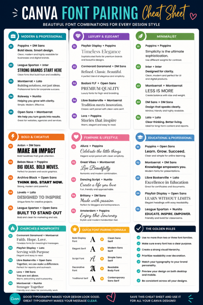
In the final section of this guide, you’ll find a Canva Font Pairing Cheat Sheet featuring some of the best ready-to-use font combinations, organized by style. Bookmark it, save it, or print it as a quick reference whenever you’re designing in Canva.